LOLALIVE
Visual Identity Creation for Lolalive - A New Business Unit of Lola Normajean
At the intersection of memorable events and revolutionary creativity, Lolalive emerges as a vibrant business unit within the Lola Normajean advertising agency. Committed to delivering unique and astonishing brand activations and events, Lolalive stands as a creative powerhouse in the world of events, closely intertwined with Lola Normajean's talented creative team.
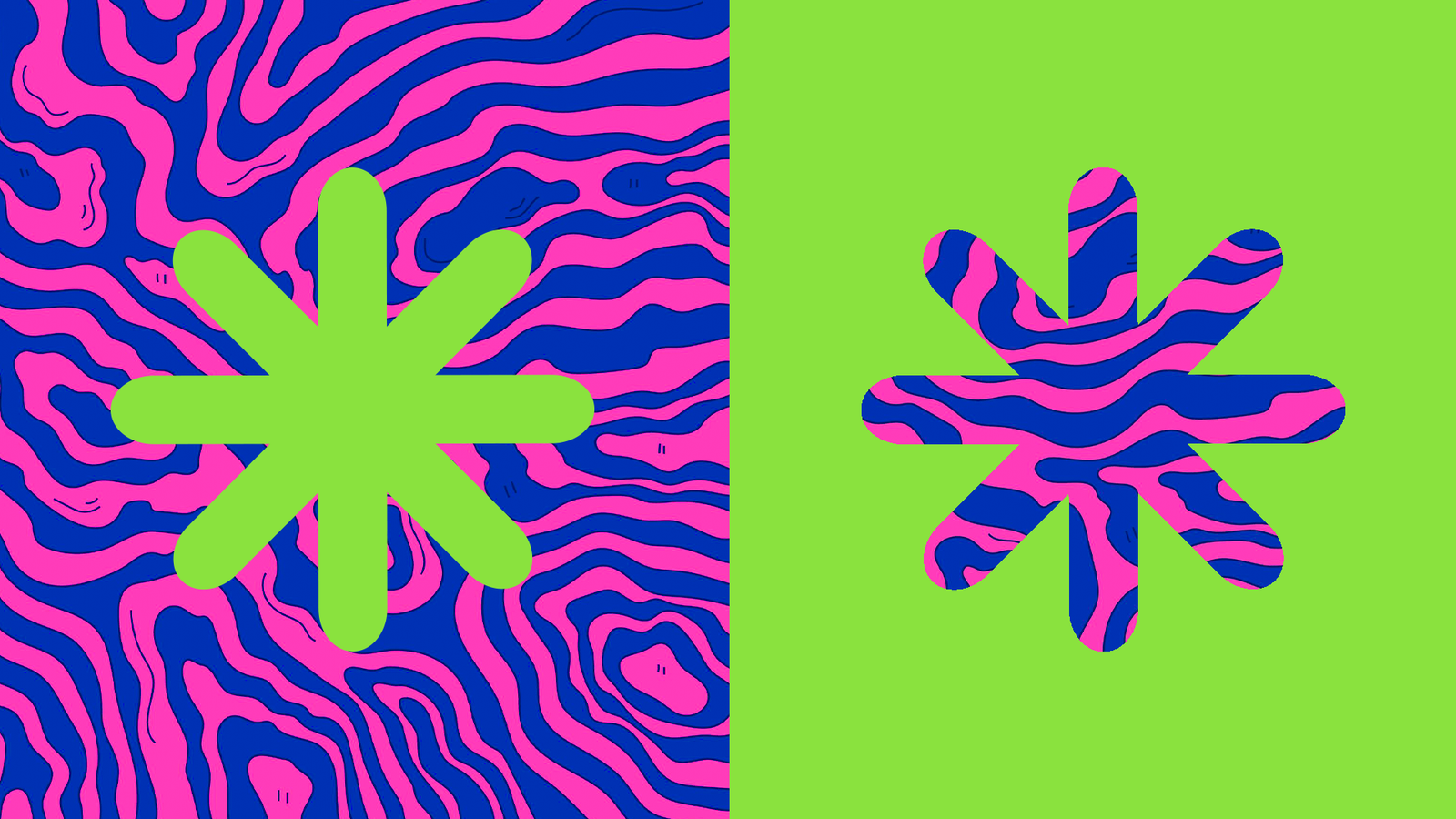
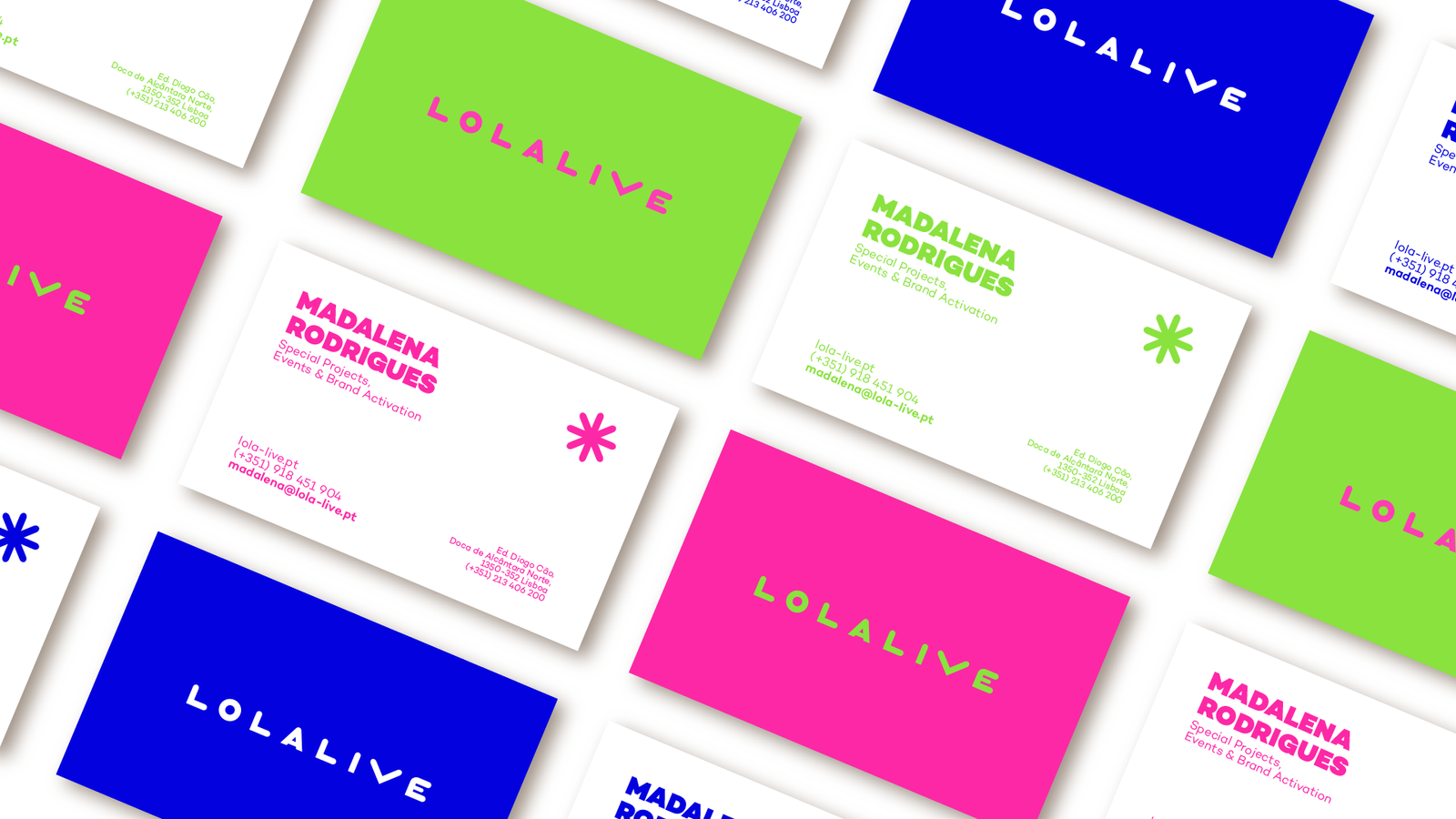
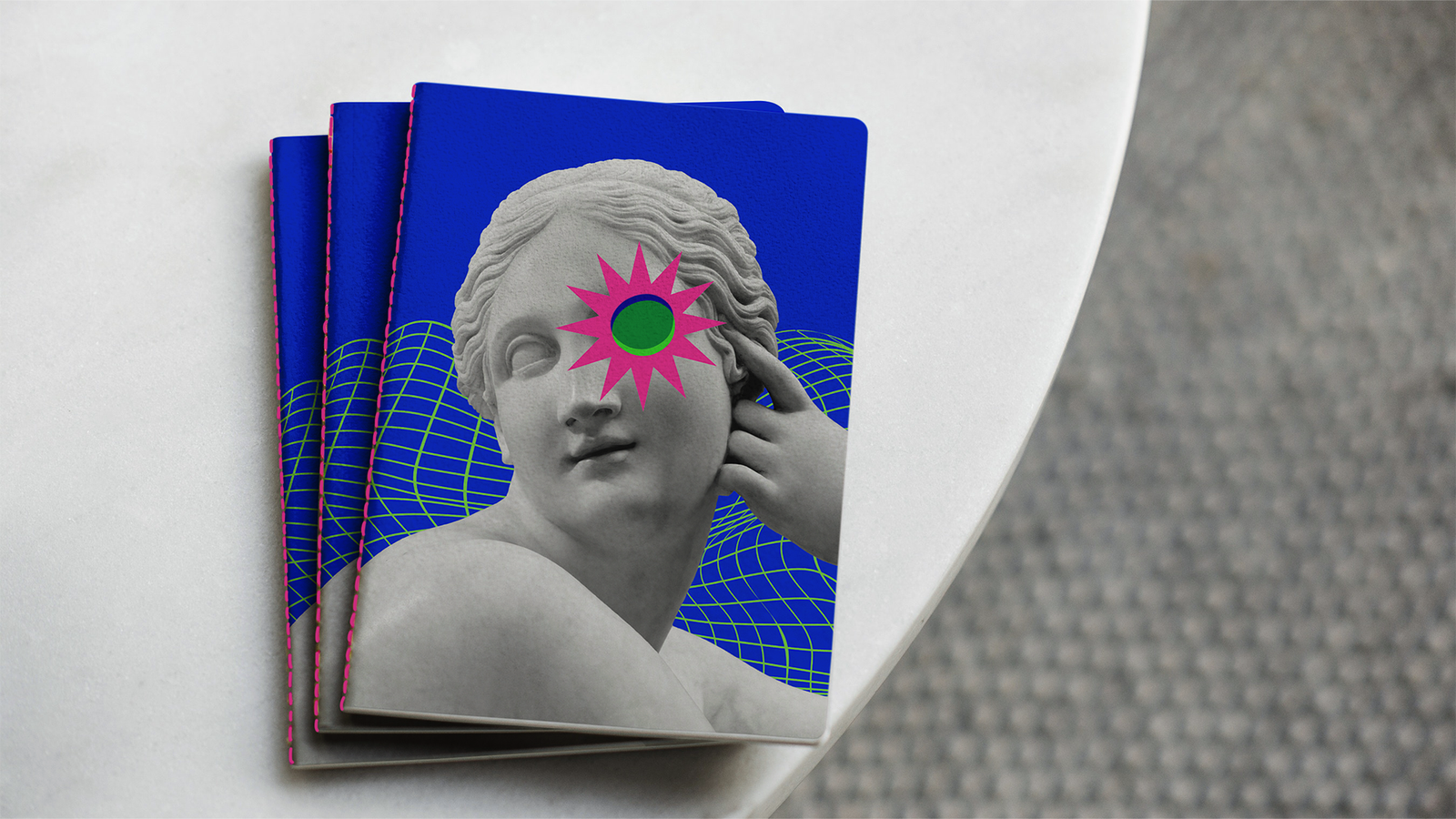
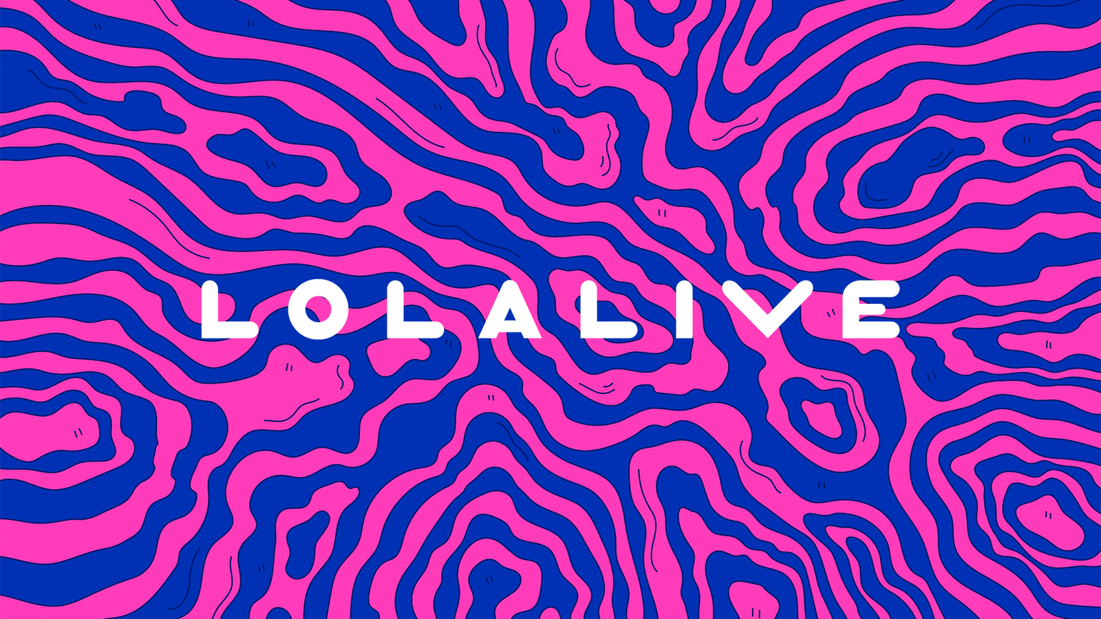
A dynamic color palette featuring vibrant shades of pink, green, and blue. The use of bold and eye-catching fonts conveys the brand's energetic persona. The central design element, a emblem made with the letter 'L' at its core, complements the identity. This emblem, akin to an asterisk, symbolizes the brand's innovative spirit and ability to shine brightly in the world of events and brand activation.
The creation of Lolalive's visual identity was an exciting challenge that involved blending elements from the worlds of events and advertising, resulting in a unique and innovative aesthetic. The chosen colors, pink, green, and blue, bring to life the energy and vitality that are at the heart of Lolalive's events. Pink represents fun and enthusiasm, green symbolizes renewal and nature, while blue evokes confidence and stability.
The creation of Lolalive's visual identity was an exciting challenge that involved blending elements from the worlds of events and advertising, resulting in a unique and innovative aesthetic. The chosen colors, pink, green, and blue, bring to life the energy and vitality that are at the heart of Lolalive's events. Pink represents fun and enthusiasm, green symbolizes renewal and nature, while blue evokes confidence and stability.


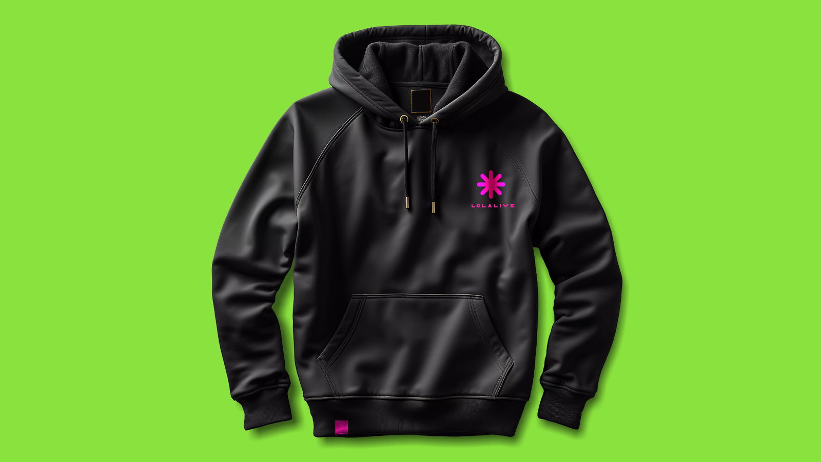
Creative Agency: Lola Normajean
Creative Agency: Lola Normajean
Selected Works
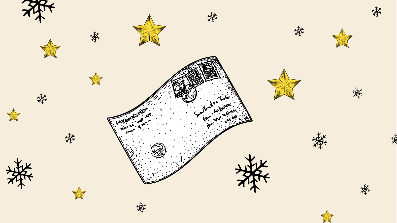
NATAL VELHOTESProject type
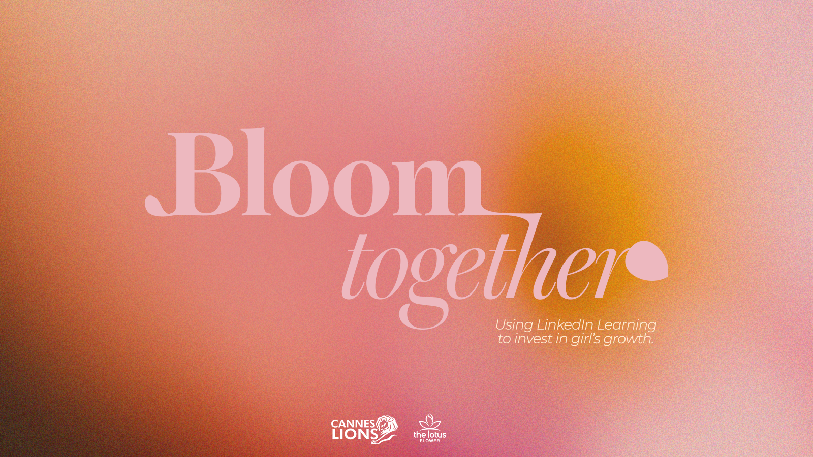
Bloom TogetherProject type

Bloom Together - DuplicateProject type
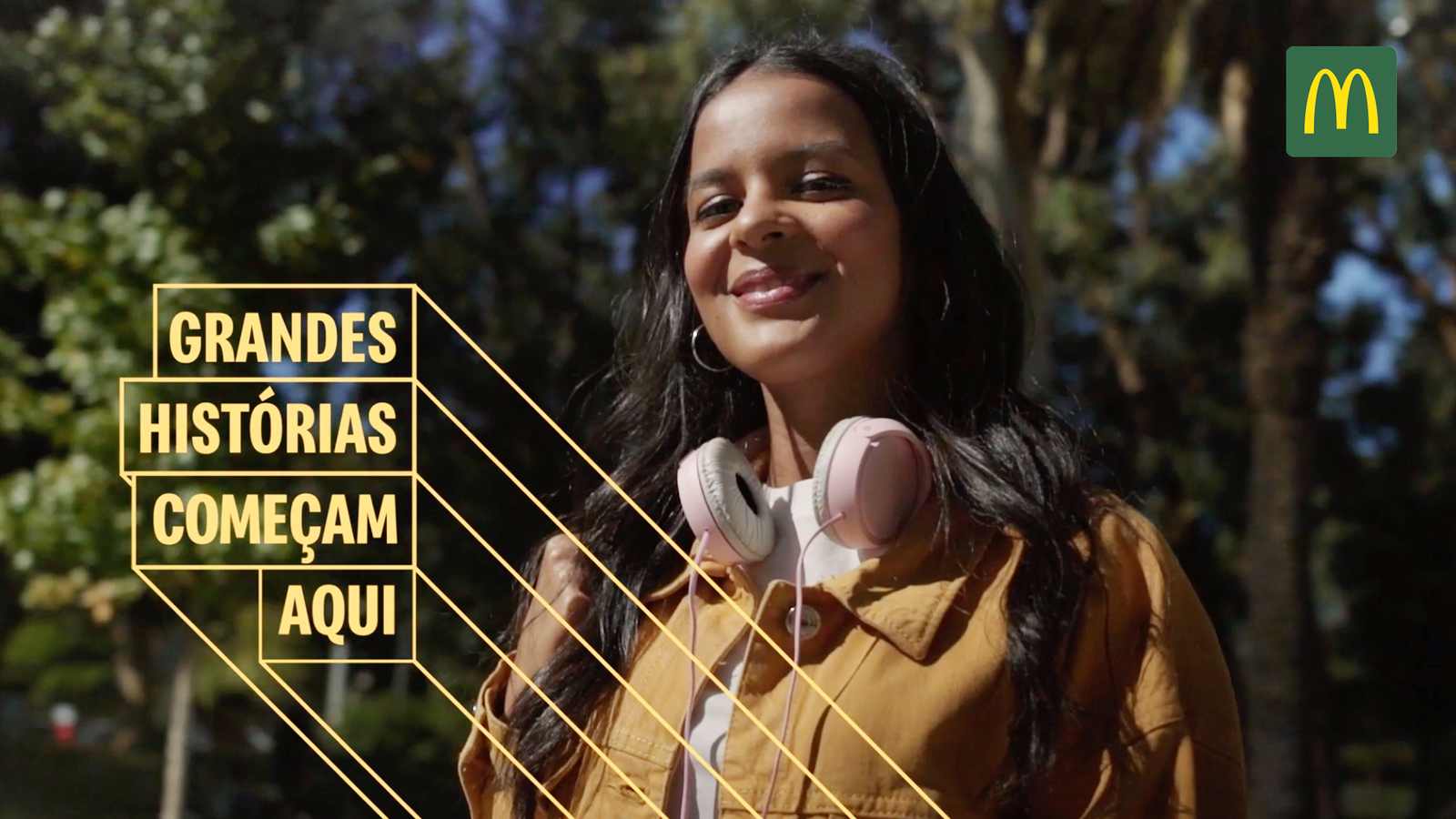
MCDONALD'SProject type
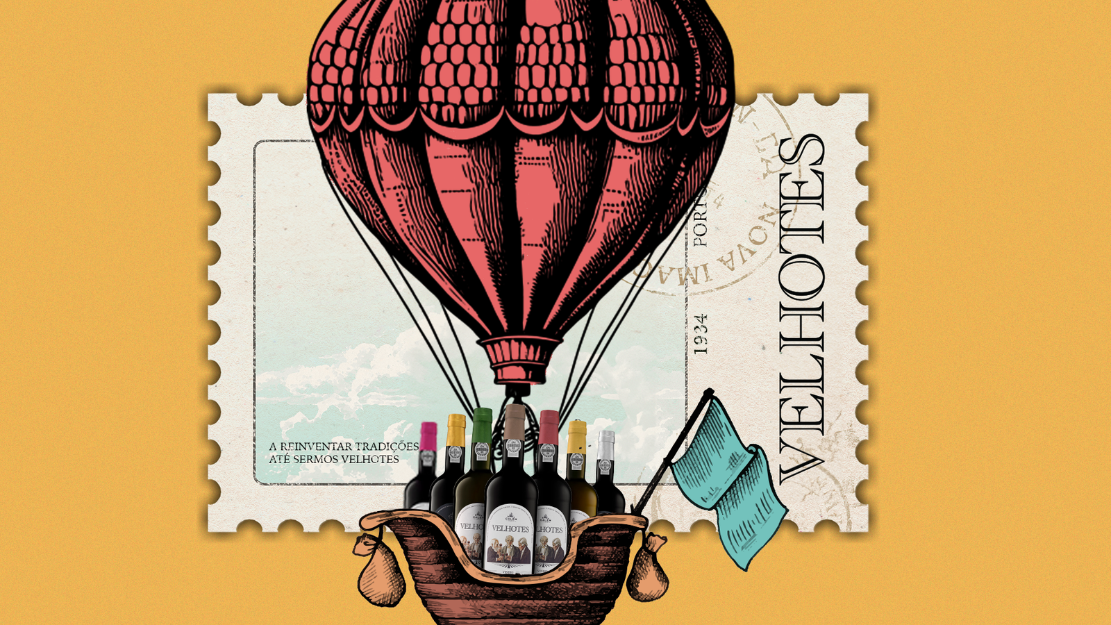
VELHOTESProject type

LACTOGEN MANIFESTProject type
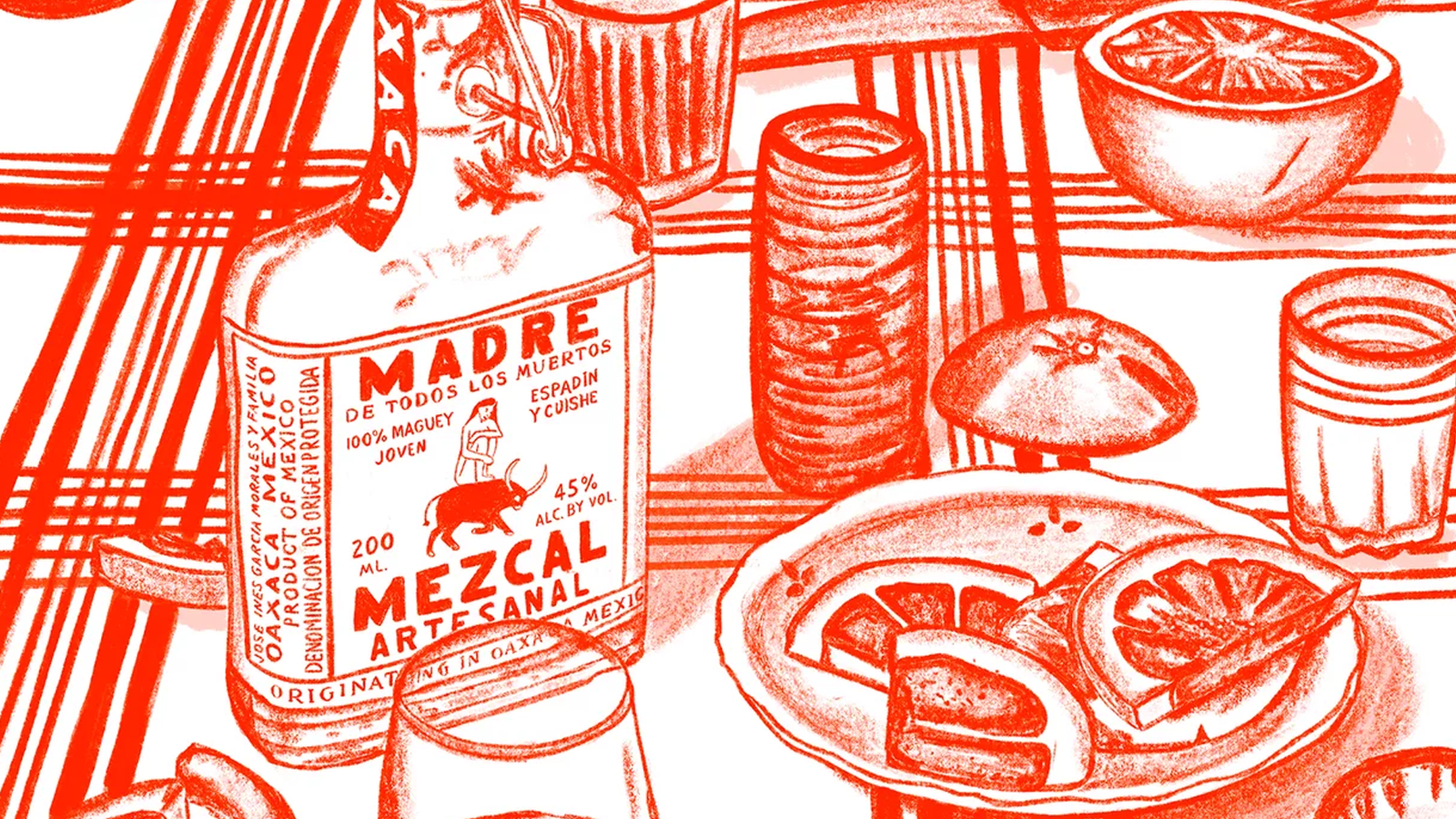
DIGITAL ILLUSTRATIONProject type
Nesquik BananaArt Direction
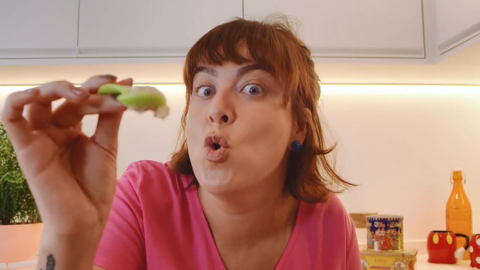
HEL MOTHERProject type
GALPProject type
LOLALIVEProject type
KANUIProject type

LACTACYDProject type
LOVE IS ON THE STREETSProject type

VIPLANTProject type
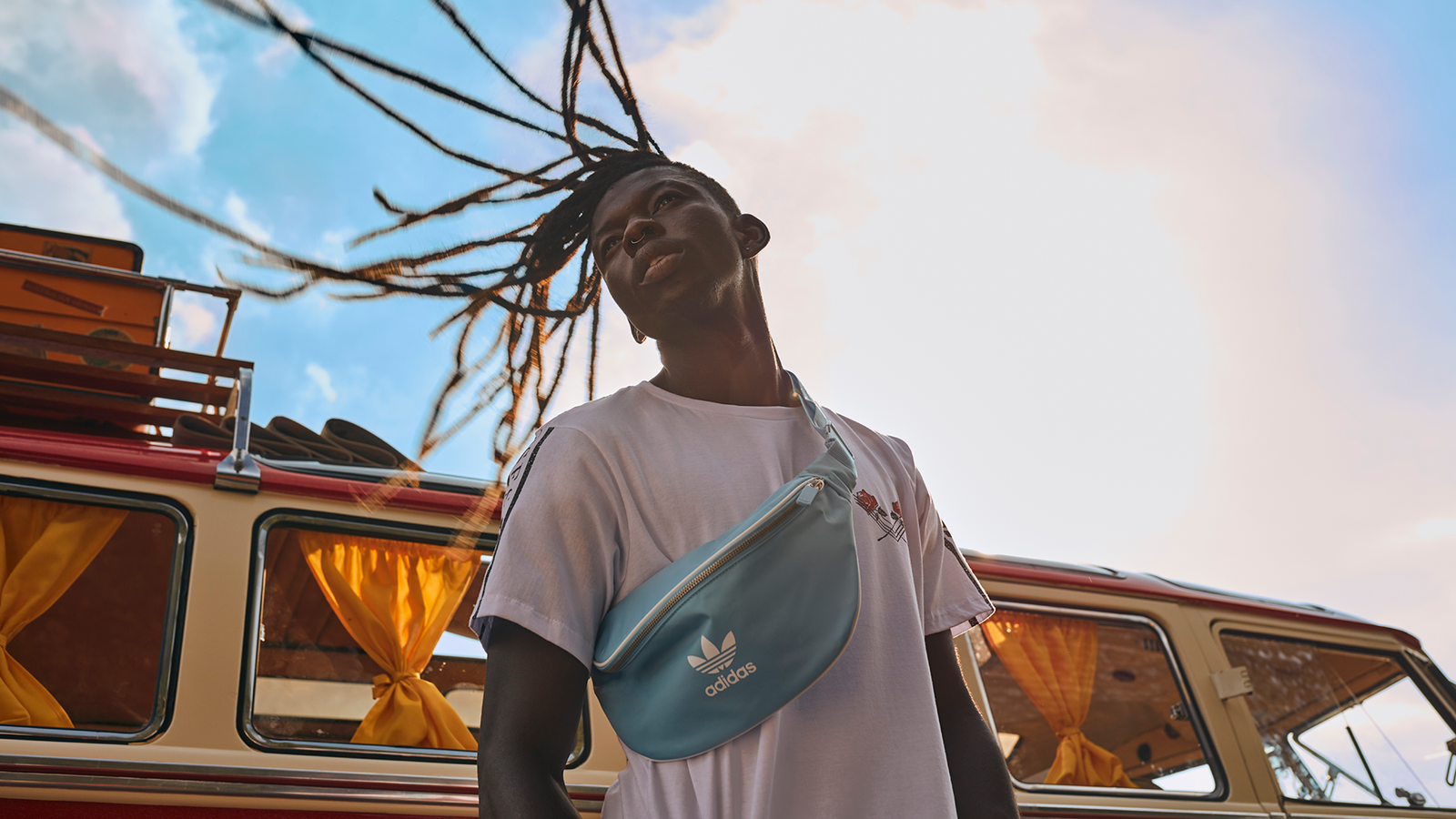
ON THE ROADProject type
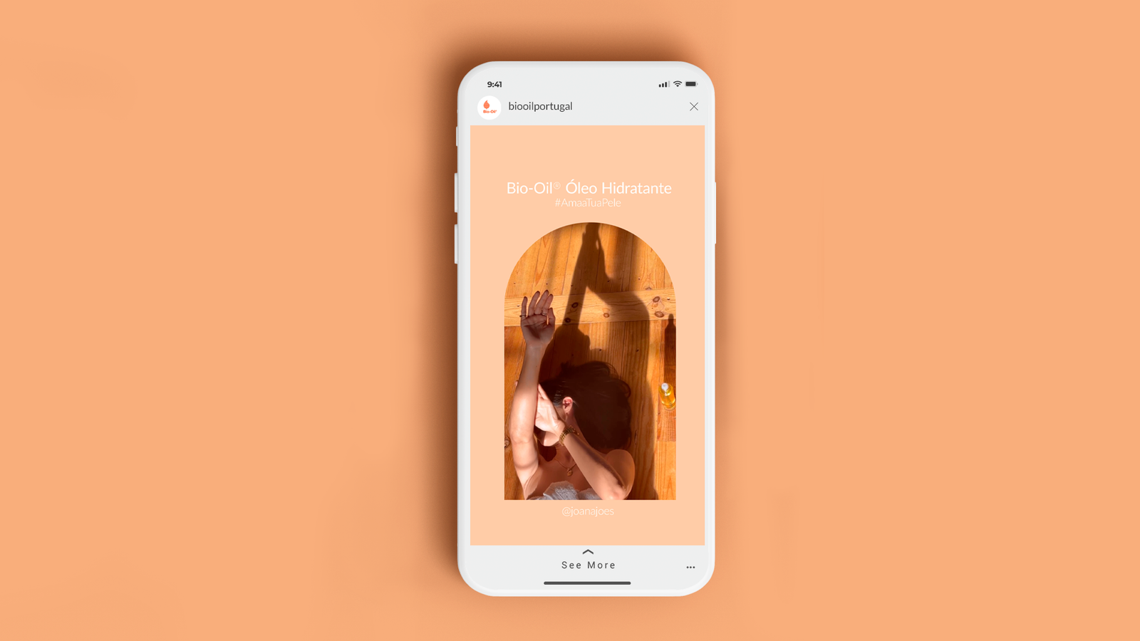
BIO-OILSocial Media Design
